
As mobile devices are getting smarter and more versatile with each new generation, our usage and dependence on mobile technology have increased. Today, we perform numerous daily tasks and activities using smartphones, whether it is paying bills, shopping, or only browsing. Studies by Statista show that 58% of internet traffic comes from mobile devices, and Fortune Business Insights states that the global smartphone industry is expected to grow from $484.81 billion in 2022 to $792.51 billion in 2029, with a CAGR of 7.3%. Based on this data, it is clear that businesses should strive to deliver an excellent digital experience by prioritizing mobile-first design because the majority of traffic will come from mobile users. Having a mobile-first design of an app is not a luxury but a requirement for any digital business.
Progressive web apps (PWAs) are becoming crucial aspects of mobile-first development, especially when it comes to creating experiences that boost user engagement and optimize app performance across all devices. This article will discuss the mobile-first approach, PWAs, and the role of PWAs in mobile-first strategy.
What is the Mobile-First Approach?
A mobile-first development strategy involves designing and releasing an app for app stores as the first user experience instead of a web app. Many development teams go a step further and only ship an app to one platform, such as Android or iOS. This approach is implemented by keeping the mobile users in mind to improve their user experience on the website.
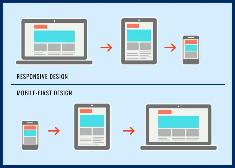
The mobile-first approach prioritizes meeting the needs of mobile users by designing a layout tailored to small screens. If the majority of your audience is on mobile devices, it is logical to avoid creating a traditional web experience and only focus on developing apps for the app stores. This shows why popular consumer apps do not have web versions.
PWA Development and Mobile-First Strategy
A progressive web app (PWA) is a type of web app that works seamlessly on any device and looks and operates like a mobile app. It provides an app-like experience, including excellent features like offline accessibility and push notifications. A PWA can work both as a mobile app and a web page. When the user visits PWA from the desktop, it will work like a web page, while if the user accesses it from a mobile phone, it will work like an app. PWAs are fast-loading, seamless, lightweight, and don't need an app store to download. Additionally, they are optimized according to Google SEO criteria.
Mobile-first PWA development aims to create a user-friendly experience for mobile users by prioritizing simple design and simple navigation. Businesses that emphasize mobile-first development and use PWAs can respond to their users' needs and stay ahead in the digital market. PWA development is one of the excellent ways to start a mobile-first strategy. It is a groundbreaking concept that combines the mobile and desktop platforms.
Read More: How To Find the Best Progressive Web App Development Company
How to Implement Mobile-First Design
A mobile-first strategy is easier to implement when you build your website as a progressive web app. If you want to design and develop your app using a mobile-first strategy, follow these steps to implement mobile-first design.
List the Content Items
Create a spreadsheet to compile the list of content items and elements you intend to include in your website. A detailed list will give you a clear understanding of the content that should be included in the design. Content for a mobile-first website should be concise and direct. Avoid clutter, fluff, and other unnecessary elements that can distract the user or make it hard to understand. This step ensures your design is complete, including all relevant content.
Establish a Visual Layout of Content
Mobile websites have certain screen size constraints, so you need to present content to users based on its importance. In the above spreadsheet, prioritize the items and choose which are the significant ones to highlight. This will help you quickly determine which elements are significant and should be placed first. Additionally, optimize media sizes to ensure seamless performance on mobiles.
Make Elements Thumb-friendly
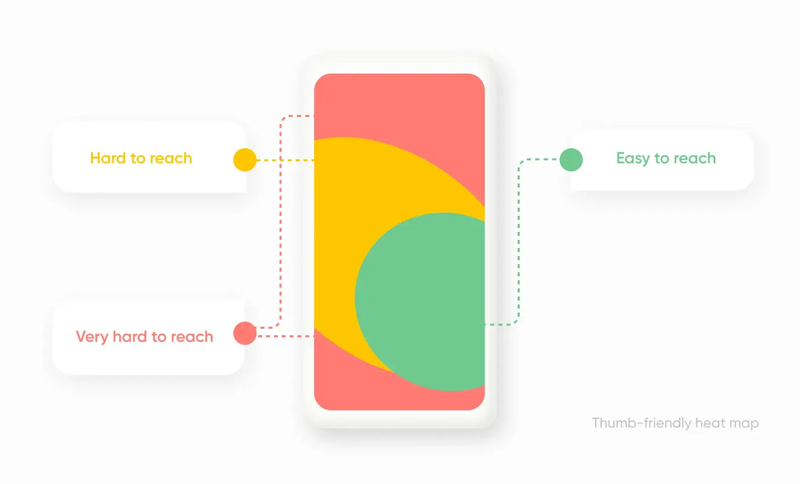
The next step of this strategy is to make the website thumb-friendly. Clickable elements like buttons, icons, and hyperlinks should be large enough to be easily tapped with a finger or thumb. The minimum recommended height and width for a clickable component is 44 pixels. To improve the size of touch targets, make sure the clickable elements are not so close. Slightly increase the size of buttons and other interactive items to make them simpler to tap. Also, leave enough space around all elements to prevent accidental touch.
Avoid Using Hover Effects
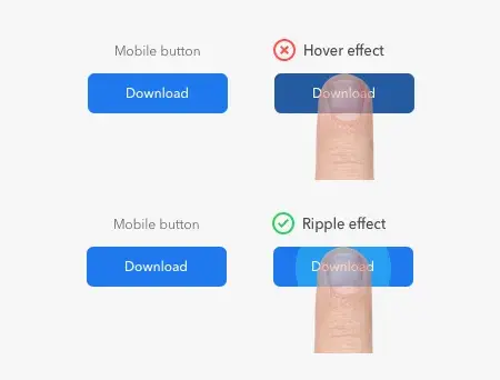
For mobile-first web design, avoid using CSS hover and mouseover effects because they are not supported on mobile phones. Mouseover and hover effects are interactive components often used in desktop interfaces. They change when the mouse moves over them. So, focus on creating a simple-to-use interface that uses touch actions like swiping, tapping, and pinching.
Design the User Interface like a Mobile App
Instead of a traditional desktop website, create the user interface of a mobile-first website like a mobile app. Expandable widgets, off-screen navigation, and AJAX calls are some of the features that mobile users expect to have more control over. When developing a mobile-first website, keep the crucial elements and remove the rest. Avoid using distracting elements like ads and pop-ups. Use simple typography and reduce the links on the navigation menu. These features in UI can offer users a more engaging experience.
Focus on Principles of Mobile-First Design
The design of your mobile-first website should be optimized according to these principles.
Fast Loading Speed: Statistics show that visitors leave the web page if it takes more than 3 seconds to load. Therefore, check your site's loading speed and, if needed, unburden your website by removing some pictures or minimizing their resolution. Faster loading speed is equally important for mobile devices because it affects ranking and UX.
Easy Navigation: Make navigation easy for users because the site is designed for smaller screens. Users can't use a website as easily as they do on a desktop, so add bottom navigation, direct links, or hamburger menus for ease of use.
Effective CTAs: CTAs should be designed to contrast with the background and elements on the site. This ensures they are quickly visible and capture the attention. Clean lines and bright colors are ideal for mobile-friendly websites. Use visually appealing CTAs instead of links that are difficult to tap on small screens.
Avoid Using Bigger Visuals
For the mobile-first website, avoid using large visuals that will not look good on small devices, such as complicated graphics or landscape pictures. Instead, use graphics that display well on small screens and appeal to mobile users. Large images can take up too much space and make navigation difficult. Also, they take longer to load, which slows the UI and frustrates users.
Test Before Deployment
Designing a perfect website is a priority for every business. However, it is as important as flawless performance. Test the mobile-first website on a real device before launch to ensure it is user-friendly and works smoothly on different devices. Test the mobile interface on a real device to evaluate the performance. You can test how quickly the webpage loads, whether the pictures and text are readable on the small screen, and how easy it is to follow the layout. Moreover, you can test if its interface responds well to touch inputs or if there are any issues with elements.
The Future of Mobile-First PWA Development
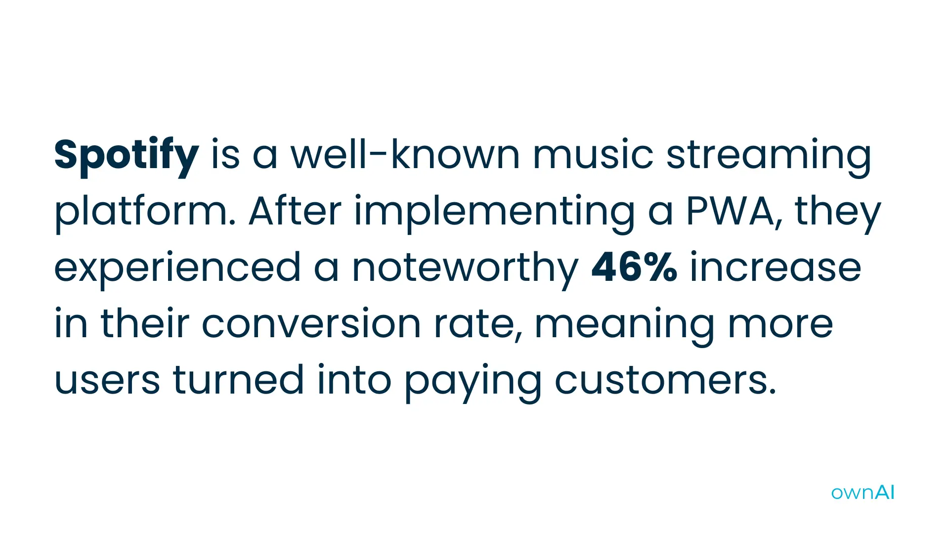
Progressive Web Apps provide a great opportunity to enhance users' mobile experience. By combining the accessibility of a website with the smooth functionality of an app, PWAs are becoming a popular choice for developers. If most of your target audience is mobile users, progressive web app development is a perfect way to implement a mobile-first strategy for your business. Users may be unable to distinguish between a PWA or responsive design during the first visit. However, the intuitive design and fast loading speed of an app will make a lasting impression on them.
As technology is evolving rapidly, PWAs are expected to become more advanced by allowing developers to build innovative solutions for users. With the extra benefits of easy navigation and offline access, it's no wonder that PWAs in mobile-first development have a bright future.
The shift in users' interest from desktops to mobile phones has made the mobile-first approach a popular topic in the development industry. By creating an engaging UI/UX with PWA, smart brands have already embraced a mobile-first strategy to harvest the maximum benefits. The leading global brands using PWA include Twitter, Facebook, YouTube, Airbnb, and Pinterest. In a nutshell, PWA development is here to stay, and software developers who prioritize the implementation of a mobile-first approach using PWAs will be ahead of the competition.
ownAI, Your PWA Development Outsourcing Partner
Looking to develop high-quality software using a mobile-first strategy for your business? Look no further than ownAI, your reliable digital product development partner. As a leading software development company, we leverage modern technologies and strategies to ensure your digital product stands out in today's market. We provide seamless mobile-like user experiences on a web platform through our top-notch Progressive Web App Development services. If you want to improve your user experience, reach a broader audience, stay ahead in a competitive digital market, and save money, ownAI PWA development is a way to do so.
Contact us today to start building a unique Progressive Web App for your business!

Let’s discuss about your next AI, Cloud or Digital Transformation.
 AI-Skilled & Agile
 Transparent, Trustworthy &
Vetted team Not tech, but business &
customer first approach


 Turn your idea into MVP in 8-16 weeks